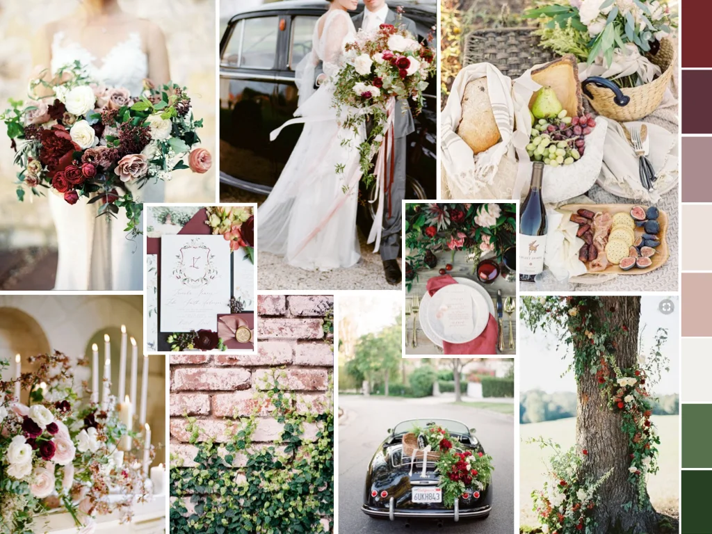
Happy Friday, friends! Autumn is officially here in New England, which is truly one of the prettiest seasons in Massachusetts. And to celebrate I am starting off this Autumn weekend with the very first storyboard for the new Storyboard Series I announced on Instagram last week!
When I create our signature AYE Design Plans for each of our incredible couples, I begin the plan with a color palette overview followed by a storyboard representative of their day. While many will refer to this type of design overview board as a “mood board,” I like to think of them more as a storyboard — a beautiful representation featuring not only the colors and textures of the celebration, but also tells the story of the day in just a glance through the inclusion of small but very significant details. While our specialty is the planning and design of luxury weddings (tented and at established venues), for our couples the story the celebration tells is just as much a top priority as is the design that leaves guests in awe. The magic that I speak of time and time again comes from the stories that my couple’s celebration exudes through the details of crystal empire chandeliers, bloom covered trees, statement bouquets, lush, layered and detailed place settings, custom illustrated stationery, and rose petal recessionals. And so when I create these storyboards I spend an extraordinary amount of time getting this particular part of their design plan perfect. This way when our vendors see this storyboard for inspiration, they can get a sense of the full scope of the celebration we are immersing ourselves in.
These storyboards are always something I make a point to share with you all in my Instagram stories as we head into a wedding weekend — it provides you with a little bit of an elevator pitch of the celebration and hints at what is to come! With such a great response from so many couples who follow along with me on Instagram and love these storyboards, I was inspired to create this series.
Over the next year I will be sharing with you 1-2 storyboards per month that you can use as inspiration for your own wedding. Created in a similar way that I create the AYE couples’ storyboards, each month I will share a storyboard featuring a specific color palette, florals, stationery, couple portraits, cake designs, catering details, pretty sips and fine details. Whether you are working with Always Yours Events or on your own, these design plans are a great way to inspire your own wedding design. Use the board as a whole or just specific elements such as color palette, a bloom or two, or a fine detail.
So without further adieu, I’m thrilled to share the month of October’s storyboard to begin this series! This rich color palette of deep burgundy, garnet, crimson, dusty rose, light blush, pale rose, winter white, bayleaf green and smilax green invokes a color saturated black tie Autumn wedding. What I love about this story is it’s unapologetic use of richer colors in the forefront, with the favorite shades of blush and dusty rose (who are usually the focal shades) as the accents. And the way the palette is carried throughout each and every aspect of the day is thorough – from the crest on the stationery to the florals in baskets casually arranged on the back of a vintage black getaway car, this color story creates cohesive visual interest from the first touchpoint to the last image of the newlyweds bringing the celebration to a close. For a couple who met at Harvard, they select a color palette filled with shades of red, and especially that iconic crimson shade. Since they find themselves traveling throughout France every year, an extraordinary French inspired cheese and charcuterie course with wine tasting and pairing would begin the dinner reception while guests continue conversation after the cocktail reception. Their love of camaraderie leads them to choose tuscan wooden tables with lush florals mixed with sandstone taper candles and crimson and garnet filled place settings mix the rustic feeling the couple loves while still fitting in perfectly with this black tie affair. And they depart from the celebration after the last dance in the groom’s beloved vintage black Porsche.

All sources for all images: Sylvi Gil Photography | Amorology + Josh Eliot Photography | Koman Photography | Erich McVey Photography | Taralynn Lawton Photography | Lani Elias Fine Art Photography
For all couples out there who love richer and saturated hues for a celebration, consider jumping in head first with a flipped design such as this one with the deeper shades in the limelight and the blush and dusty rose shades creating a soft accent and transition. To further this design, I’ve created a Pinterest board featuring these images and more, so be sure to take a peek for more inspiration!
Enjoy this lovely weekend, friends! Happy planning!
xo,
Keri